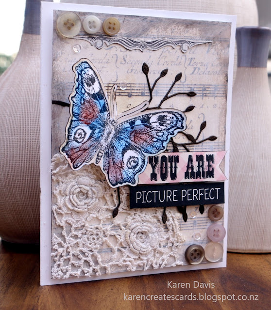
The theme for this week's challenge at The Card Concept is Vintage Notes. The inspiration is chockablock full of elements to inspire you. If vintage is not your thing, take the elements and use your own colour palette. Have fun!!
As I have said many times, I love vintage, and layers, and distress ink, especially Walnut, the original.
Every element on my card is old. The doily is one of my mother's op-shop finds from many years ago. The background paper, flourish (at the top of the card), branch, buttons, and sentiment are items purchased several years ago. The butterfly stamp is at least 10 years old.
I started by adhering the background paper to a piece of card.
I then subdued the design by brushing White Golden Fluid Acrylic paint around the edges. I like this brand because it flows beautifully, and it dries clean and transparent. If I want something more Opaque I use standard acrylic paint or Gesso.
I treated the edges with Walnut Distress Ink. The previous layer of acrylic paint stops the distress ink from absorbing into the paper, so it sort of slides around the surface. I liked the softer effect.
As I wanted a clean shabby card, I decided not to distress (as in mangle :) the edges.
I mounted the background on foam tape then proceeded to add the elements as you see them on the card.
The butterfly is coloured with chalk, my 'go-to' when I want a really soft, transparent, blendable, non-absorbant colour.
The sentiment and butterfly have walnut ink edges.
Here are the links to the design team's blogs:-


